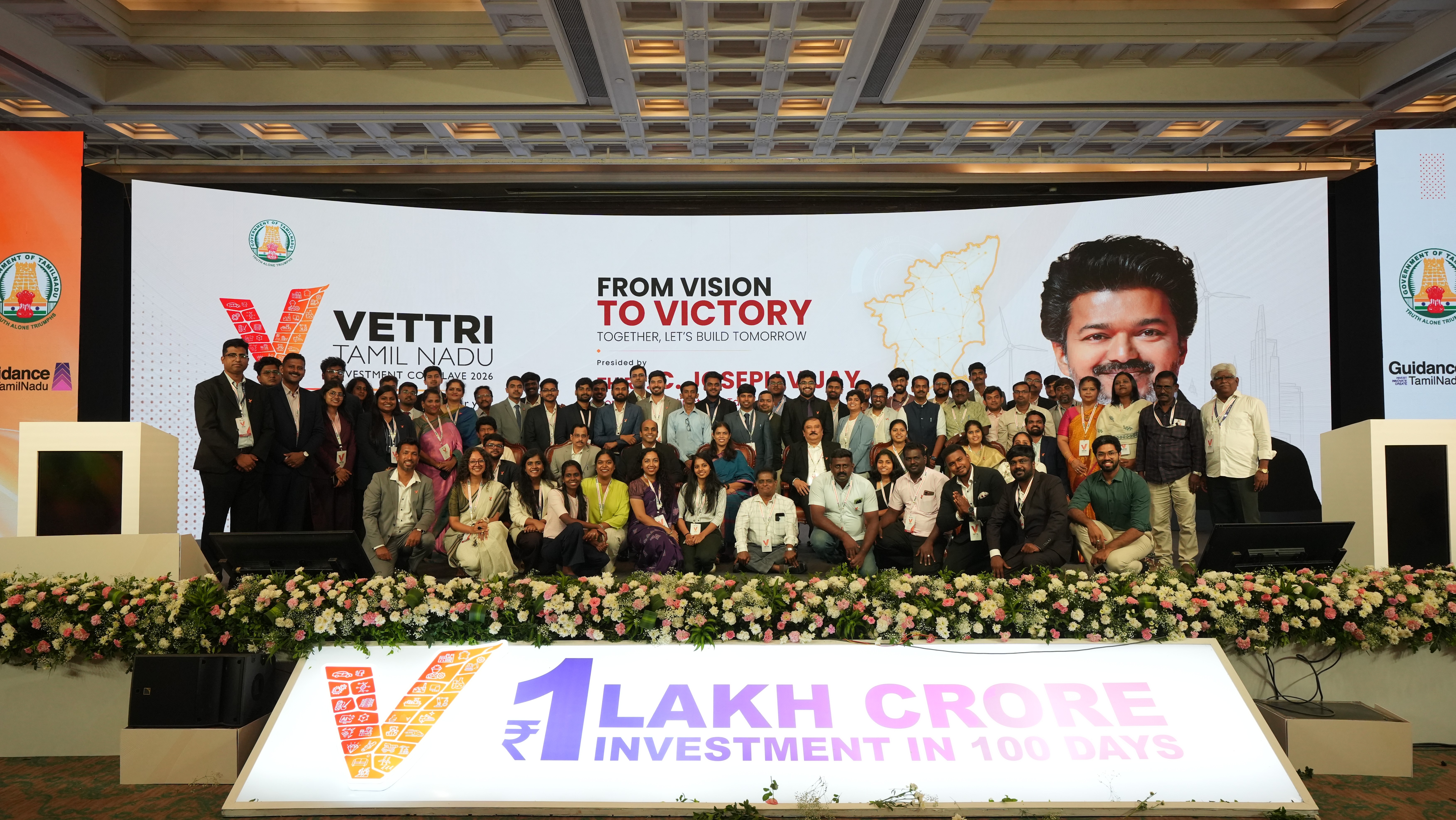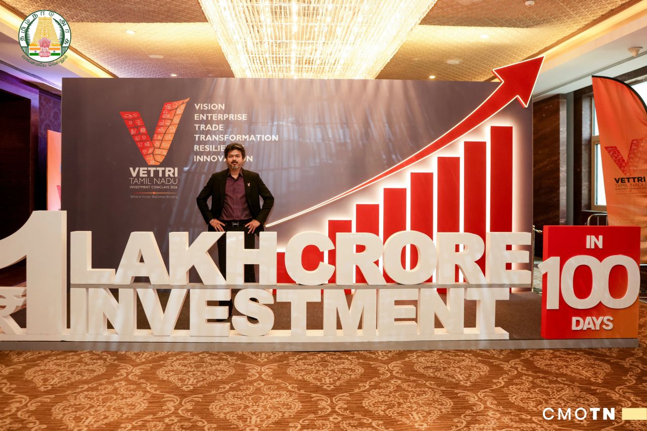
Vettri Tamil Nadu was the newly formed government's first investment event and the first time ₹1 lakh crore in MoUs was set to be signed at a single conclave. The stakes were unlike a routine event: this was effectively the administration's first public economic proof point, watched closely by both media and industry.
Building alignment before design. Before any visual work began, I took part in three rounds of discussions with department secretaries to align on what the campaign needed to communicate and how the state's growth story should be framed for a mixed audience of government, industry, and press.
Getting the mandate. Following these discussions, the Chief Minister's Office directly briefed me to lead the event's logo, unit design, theming, and overall on-ground setup placing full creative ownership of the conclave's identity in my hands.
Working against the clock. The event was fixed for August 13th, but final sign-off on creative direction only came through on August 10th. That left a 48-hour window to conceive, design, and execute the entire visual identity and event environment with no room for a second review cycle, given the event's public visibility.
Landing the identity. Working fast against the 48-hour window, I brainstormed the branding direction with my team and in parallel with the Chief Minister's Office, testing names and framing that could carry both the weight of a first-of-its-kind event and the urgency of the moment. Together, we arrived at "Vettri Investment Conclave" Vettri meaning "victory" in Tamil paired with the tagline "Where Vision Becomes Victory," capturing the shift from policy intent to tangible economic outcome in a single line.


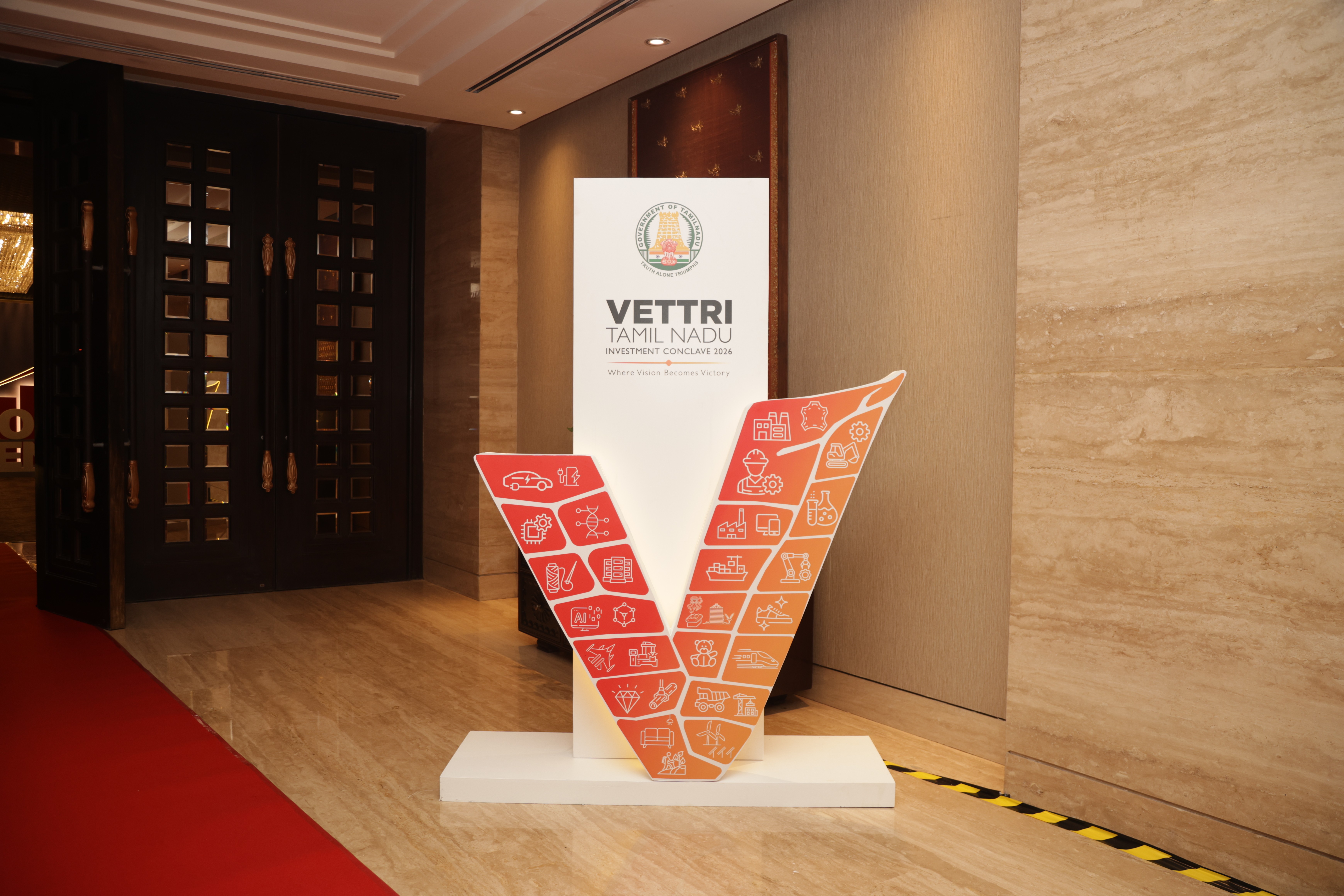
With the logo and identity finalized, I moved immediately into execution collaborating closely with an external vendor to translate the brand identity across the full scope of the event: stage backdrops, on-ground event design, presentation decks, delegate invites, and newspaper advertisements. Given the 48-hour window, this meant briefing the vendor and reviewing outputs in near-parallel rather than in sequence, to keep every touchpoint visually consistent under time pressure.